Timer Control
Description Use a timer control with forms where records need to meet a specific time-based milestone. A timer control shows people how much time is available to complete an action in the resolution of an active record or how much time has passed since the time to complete the action has passed.
Timer control Data Source properties use fields for the entity.
Failure Time Field Type uses a date-time field to set the time.
- The three condition fields use one of the Option Set, Two Options, Status, or Status Reason fields for the entity.
Calendar control

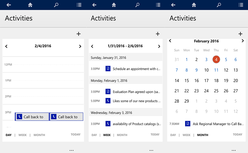
Description Use this control to configure forms so they show up as a calendar view in Dynamics 365 for phones and tablets. You can also use this control to replace dashboards, lists, or entity grids for phones and tablets.
| Property |
Description |
| Start Date |
Define the start date and time of the item to visualize in the calendar view. The available values are any of the columns in this view of type date. |
| End Date |
Define the end date and time of the item to visualize in the calendar view. The available values are any of the columns in this view of type date. |
| Duration |
The duration in minutes. If you specify a value for End Date, Duration is ignored. |
| Description |
This is the caption you want to see for calendar items. |
The minimum duration shown in the calendar is 30 minutes. Items with a duration less than 30 minutes will still appear as 30 minutes long.
The calendar control supports all date behaviors (User Local, Date Only, and Time-Zone Independent).
Timeline control
Provide a timeline of recent, relevant news articles and Twitter tweets for an account.
| Property |
Description |
| CC_Timeline_Title |
Property to map for the title of each timeline item. |
| CC_Timeline_Title_Desc |
Description for Title. |
| CC_Timeline_Label1 |
Field to be displayed below the title of timeline item. |
| CC_Timeline_Label1_Desc |
Description for Label 1. |
| CC_Timeline_Label2 |
Field to be displayed after Label 1. |
| CC_Timeline_Label2_Desc |
Description for Label 2. |
| CC_Timeline_Label3 |
Field to be displayed after Label 2. |
| CC_Timeline_Label3_Desc |
Description for Label 3. |
| CC_Timeline_Label4 |
Field to be displayed after Label 3. |
| CC_Timeline_Label4_Desc |
Description for Label 4. |
| CC_Timeline_Label5 |
Field to be displayed after Label 4. |
| CC_Timeline_Label5_Desc |
Description for Label 5. |
| CC_Timeline_Timestamp |
Field to use for sorting timeline in reverse chronological order. |
| CC_Timeline_Timestamp_Desc |
Description for Timestamp. |
| CC_Timeline_Group |
Field to map for grouping timeline. |
| CC_Timeline_Group_Desc |
Description for Group field. |
| CC_Timeline_GroupOrder |
Order of the group the item belongs to relative to other groups (assign values 1, 2, 3, and so on for groups to be displayed). The group will be displayed in ascending value of group values assigned. |
| CC_Timeline_GroupOrder_Desc |
Description for Group Order field. |
| CC_Timeline_URL |
URL field to map for displaying the URL of each timeline item. |
| CC_Timeline_URL_Desc |
Description for URL field. |
| CC_Timeline_ThumbnailURL |
Field to map for thumbnail of image/icon to display for each item. |
| CC_Timeline_ThumnailURL_Desc |
Description for the ThumbnailURL field. |
| CC_Timeline_Filter |
Field to map for timeline filter. |
| CC_Timeline_Filter_Desc |
Description for Filter. |
| CC_Timeline_Footer |
Web resource to display as the footer of the timeline. |
| CC_Timeline_Footer_Desc |
Description for Footer field. |
Linear slider

Description The linear slider control lets your users input numerical values by dragging a slider and provides an option for typing in the quantity. The slider provides whole number input and display only.
Field Type Use this control for any numerical or money field.
| Property |
Description |
| Max |
Set the maximum value to display on the slider. |
| Min |
Set the minimum value to display on the slider. |
| Value |
The value to display on the slider. |
| Step |
Set the amount to add or subtract from the current value when entering data with this control. |
Option sets

Description The option set control presents a set of choices for your users to choose from when entering data.
Field Type Use this control for option sets with two or three choices only.
| Property |
Description |
| Field |
Shows the field that the control is mapped to. |
Flip switch

Description The flip switch is like an on/off switch, providing a choice between two values.
Field Type Two Options
| Property |
Description |
| Field |
Shows the field that the control is mapped to. |
Star rating

Description Use the star rating to provide a visual representation of a rating. The maximum number of stars you can set is five.
Field Type You can use this control for whole numbers only; it can’t accept decimal values.
Note Be sure to select the Hide on web option for this control.
| Property |
Description |
| Max |
Select the maximum number of stars for the control from the dropdown list. |
Radial knob

Description The radial knob provides a way for users to enter data by sliding the knob, and shows up on the screen as a circle. The radial knob control provides whole number input and display only. You can use touch to change the value, or you can use the keypad to focus on the number and edit it.
Field Type Use this control for any numerical or money fields.
Note This control isn’t supported on Android 4.2 and 4.3 devices. It impacts the scrolling experience on those versions.
| Property |
Description |
| Max |
Set the maximum value to display on the gauge. |
| Min |
Set the minimum value to display on the gauge. |
| Value |
Get or set the value to display on the gauge. |
| Step |
Set the amount to add or subtract from the current value when entering data with this control. |
Website preview

Description Use the website preview control to map a URL field and show a preview of the website.
Field Type URL
Important By enabling this control, you consent to allow your users to share certain identifiable device information with an external system.
| Property |
Description |
| Field |
Shows the field the control is mapped to. |
Bullet graph

Description The bullet graph control displays a single key measure with a comparative measure and qualitative ranges to instantly signal whether the measure is good, bad, or in another state. Use this control in dashboards for any numerical or money field. For example, you can map the value to actual revenue and the target to estimated revenue to visualize actual versus estimated revenue.
Field Type Us this control with any numerical or money field
| Property |
Description |
| Max |
Set the maximum value to display on the graph. |
| Min |
Set the minimum value to display on the graph. |
| Good |
Set a value that’s considered good for the measure (optional). |
| Bad |
Set a value that’s considered bad for the measure (optional). |
| Value |
Shows the field that the control is mapped to. |
| Target |
Map this to the field you want to compare the value with. For example, if Value is mapped to Actual Revenue, you can map Target to Estimated Revenue, or you can provide a static value. |
Pen Control

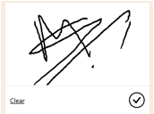
Description Use the pen control to capture written input such as signatures.
Field Type Text, multiline
Note The minimum recommended Maximum Length specified for the field this control maps to is 15000. Be sure to select the Hide on web option for this control.
| Property |
Description |
| PenMode |
Specify PenMode!Draw, PenMode!Erase, or PenMode!Select to determine what happens when a user drags a pointing device in a pen control. |
Auto-complete

Description The auto-complete control filters an item list as you type and lets you select a value from the drop-down list. For example, you can use this control to let users choose from a dropdown list of states or countries/regions.
Field Type This control maps to a Single Line of Text type field.
| Property |
Description |
| Field |
Shows the field the control is mapped to. |
| Source |
Set the source for the data (Grouped Options, Option Set, or View). |
| Option Set |
Select the option set for this field. |
| View |
Select the entity and view for this field. |
| Field |
Select the field of the view’s primary entity to use as the data source. |
Multimedia

Description You can embed videos to provide a richer customer experience for sales and field people on the go. Use this control to map to a URL field that contains the audio or video link to play in the control.
Field Type URL
Note This control is supported on Android versions 4.4 and later. YouTube videos aren’t currently supported on Windows 8 and Windows 8.1 tablets and phones. On Windows 10, only HTTPS videos (including YouTube) are supported.
Supported media types include:
- Streaming MP4 files
- YouTube videos
- Azure media
- Audio streams
| Property |
Description |
| Media |
Enter the URL of the media to play in this control. |
Number input

Description Use the number input control to help users enter data quickly. Users only have to tap the plus and minus buttons to change a numeric value in increments you set. Users can also type a number directly into the field. This field is only supported in edit mode.
Field Type Use this control for any numerical or money field.
| Property |
Description |
| Step |
Set the amount to add or subtract from the current value when entering data with this control. |
| Field |
Shows the field the control is mapped to. |
Input Mask

Description With the input mask control, you set the formatting for a field like phone number or credit card to prevent entering invalid data. For example, if you want users to enter a United States phone number in the format +1-222-555-1011, use the input mask +1-000-000-0000.
Field Type Formatted fields.
| Property |
Description |
| Mask |
Enter the mask to use for validating data as users enter it. You can use a combination of the following characters for the mask:
0 – Digit
9 – Digit or space
# – Digit, sign, or space
L – Letter
I – Letter or space
A – Alphanumeric
A – Alphanumeric or space
< – Converts characters that follow to lower case
> – Converts characters that follow to upper case
| – Disables case conversion
\ – Escapes any character, turning it into a literal
All others – Literals |
| Field |
Shows the field the control is mapped to. |
Linear Gauge

Description The linear gauge lets your users input numerical values by dragging a slider instead of typing in the exact quantity. The slider provides whole number input and display only.
Field Types Use this control for any numerical and money fields.
| Property |
Description |
| Max |
Set the maximum value to display on the gauge. |
| Min |
Set the minimum value to display on the gauge. |
| Value |
Get or set the value to display on the gauge. |
| Step |
Set the amount to add or subtract from the current value when entering data with this control. |
Arc knob

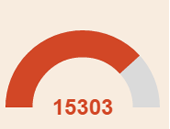
Description The arc knob provides a way for users to enter data by sliding the knob, and shows up on the screen as an arc. The arc knob control provides whole number input and display only. You can use touch to change the value, you can also focus on the number and edit it using the keypad.
Field Types Use this control for any numerical and money fields.
Note This control isn’t supported on Android 4.2 and 4.3 devices. It impacts the scrolling experience on those versions.
| Property |
Description |
| Max |
Set the maximum value to display on the gauge. |
| Min |
Set the minimum value to display on the gauge. |
| Value |
Get or set the value to display on the gauge. |
| Step |
Set the amount to add or subtract from the current value when entering data with this control. |
Canvas App

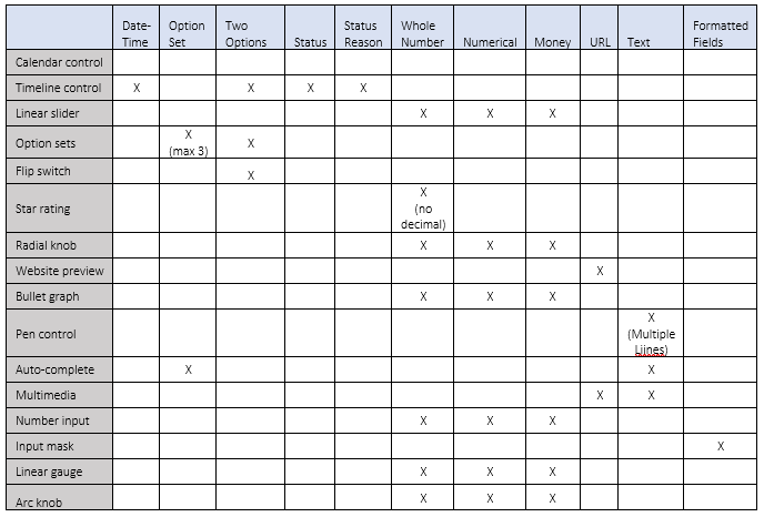
Custom Control Ref Chart

Share on Facebook
